

By Nikhil Dixit on Wed, Feb 05, 2020
Steve Jobs said, “You've got to start with the customer experience and work backward toward the technology – not the other way around.”
It goes without saying that user-centric design creates better experiences and is the cornerstone of quick adoption of a product or service.
High usability, or a quality User Interface (UI), ensures that a user of a solution or product completes a task quickly and efficiently. The UI remains important as it contains important components that users can see and “touch” like menus, options, buttons, layouts, and navigation elements that drive User Experience (UX).
While many organizations deliver on UI, they fail to prioritize UX.
UX done right ensures that in addition to completing a task, the user experiences an element of ‘delight’ and a ‘desire to reuse’. UI and UX are not in competition with each other. UI and UX must work hand in hand to provide the best experience and enormous benefits to a user.
Did you know great User Experience (UX) design can increase the usage of your website or web portal by 80% or more?
Sagitec is driving this synergy between the UI and UX in the solutions and technologies that we create. While working on any deliverable we not only ask ourselves the question “Can the user accomplish their goal with effectiveness, efficiency, and satisfaction?” but also, “Did the user have as satisfying an experience as possible in doing so?” Prioritizing user experience by user interface and experience designers promotes a deep understanding of users that includes their needs, what they value, and their abilities and limitations. Improving UX is a continuous process that takes into account user feedback at periodic intervals of time.
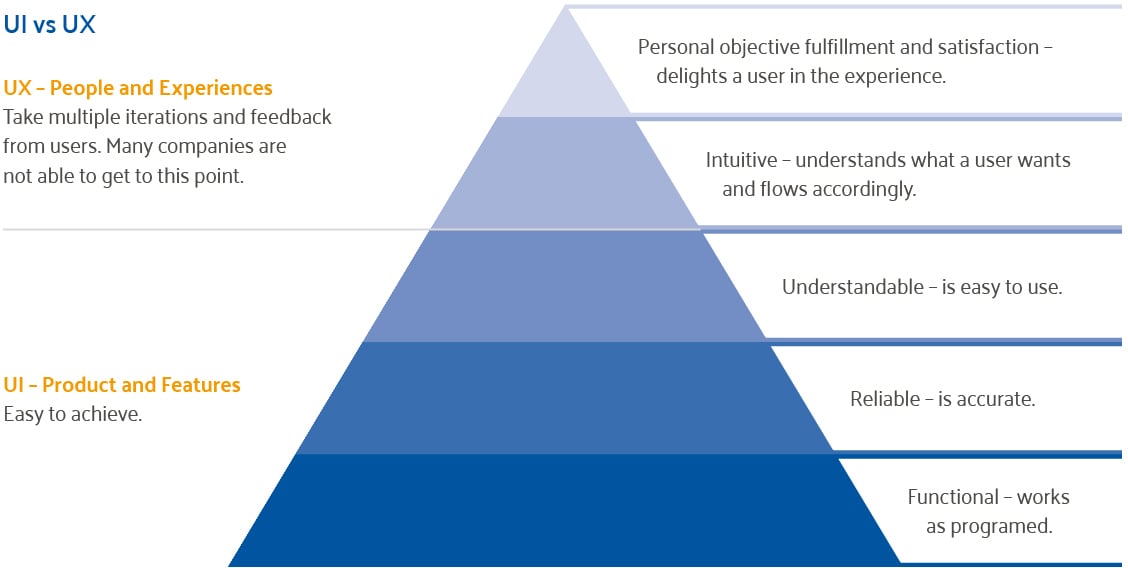
We can further differentiate between UI and UX by contrasting them with Maslow’s hierarchy of needs. This model begins with the most basic of needs like food and water and gradually ascends through the needs of safety, love, and belonging, and esteem to self-actualization as the end goal.
The graphic shows that UI is the most basic of all the elements – being functional, reliable, and understandable. UX is about the emotional experiences of a user – Is it convenient to use? Does it satisfy a user when they complete their objectives prompting them to come back?

Let's look at some terms that are commonly used to improve a website or portal in terms of usability and experience.
UI
The layout – The layout is how things appear on a screen. It needs to be functional and easy to use. It should be reliable and function in the “way it is supposed to” (i.e be intuitive to the user).
Placement – Usability standards show that the perceived importance of an element decreases from top to bottom and left to right. So if you want to showcase something, the top-left corner of a screen is the best location.
Navigational flows – good design standards dictate that elements should flow from left to right. Users read and understand better than in any other direction. A general rule is to have a minimum number of clicks to achieve a goal.
Simplification – Performing work must be simple. Clutter or distractions on screens result in a bad experience deterring users from continuing to use the solution.
Implementation of these concepts comprises UI.
UX
As stated earlier, UX refers to the experience users have while interacting with the solution. The following are some common UX concepts that improve the desire of the user to reuse the solution.
Typography – The readability of chosen font sizes and types is extremely important. Different users prefer different typography - so the best practice is to allow the user to select their preference.
Colors – The right color choices will grab the users' attention and keep them on the site. A recommended technique is to use different colors for the different types of user actions.
Iconography – Choosing the right icons makes everything simple. For example, everyone knows a home button stands for the homepage and that this icon is synonymous with that action.
Before designing a UI, it is important to study the user preferences. For example, web accessibility standards and good design principles show that the buttons should be flatter and the font sizes should be sharp and color neutral.
These techniques can help benefit administration agencies improve their customer’s experience. As more and more users demand self-service, a well thought out and quality UI and UX enables users to complete tasks on their own without having to call your call-center. A good intuitive design drives reuse and eases the workload on your employees.
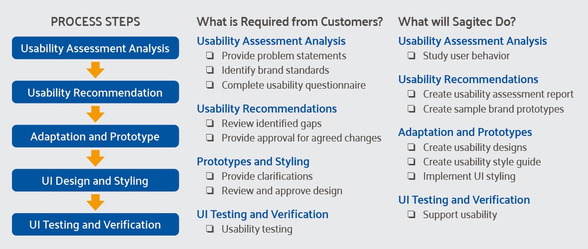
Sagitec’s Process of Developing a Great Usability Design
The image below shows our process of designing a great portal. Our goal is to identify the most advantageous UI elements and preferences to drive a superb UX before our clients begin their digital transformation journey rather than late in the implementation process during testing. We conduct a usability assessment, provide recommendations, develop prototypes early and long before user acceptance testing – not the other way around.
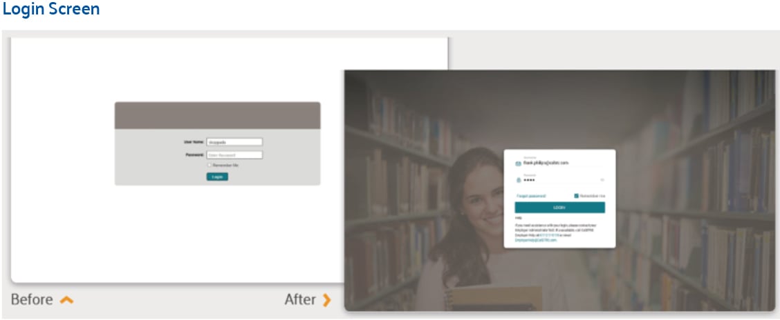
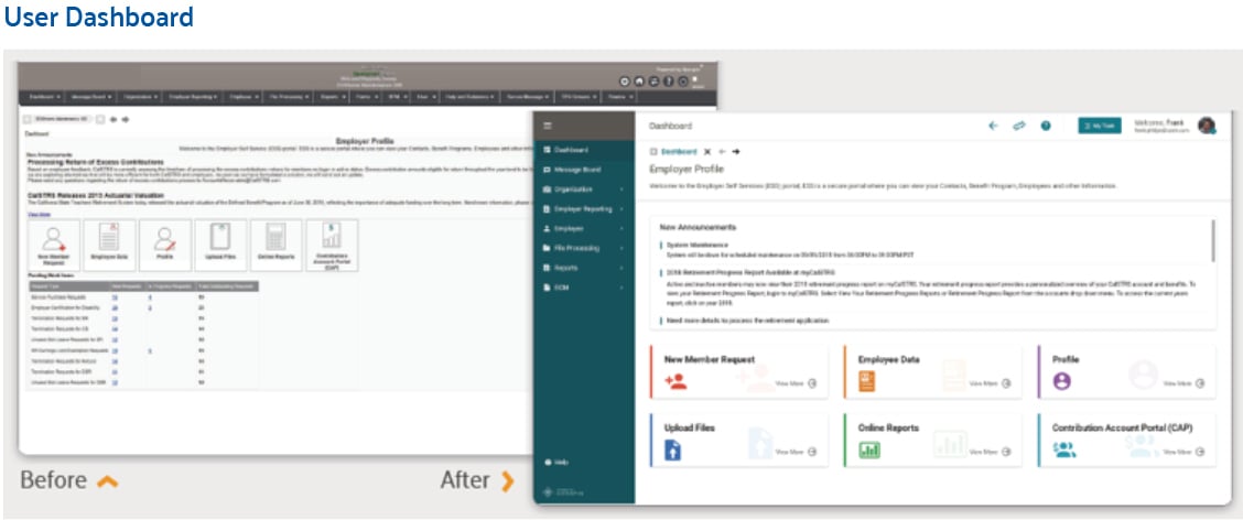
Take a look at some screens we designed and see for yourself how simple steps make a big difference in self-service adoption.
Benefits that great usability provide
Many labor and employment agencies are now moving to paperless self-service portals driving the need to keep claimants’ and employers’ desires and experience with your web portals at the forefront. Driving synergy between UI and UX provides many benefits:
- A well-designed portal has a significant impact on service delivery – if it is able to save at least 1 sec from each page, claimants’ and employers can collectively save anywhere from a few minutes to even hours of time. Claimants and employers will be able to complete their requirements quickly and efficiently, keeping them engaged on the portal.
- A great experience drives up self-service adoption rates and reduces the workload on your employees through a reduction in calls to the call center.
- Claimants and employees are more satisfied with improved user experience and the positive perception of your agency increases.
- Waiting to develop additional features until after go-live can be an expensive proposition. Smart UX design early in the process helps you mitigate the risks and launch confidently. It also helps avoid scope creep and cuts down development costs
We all have stories of great user experience that created product/service loyalists. We need to learn from these stories and identify areas where we can improve UX. Sagitec is committed to doing this, are you with us?
If you would like to read more such articles, read our newsletter. Click below.


What is the difference between data conversion and data cleansing?

FHIR Compliance: Cloud Deployment Options for Health Plans

No Comments Yet
Let us know what you think